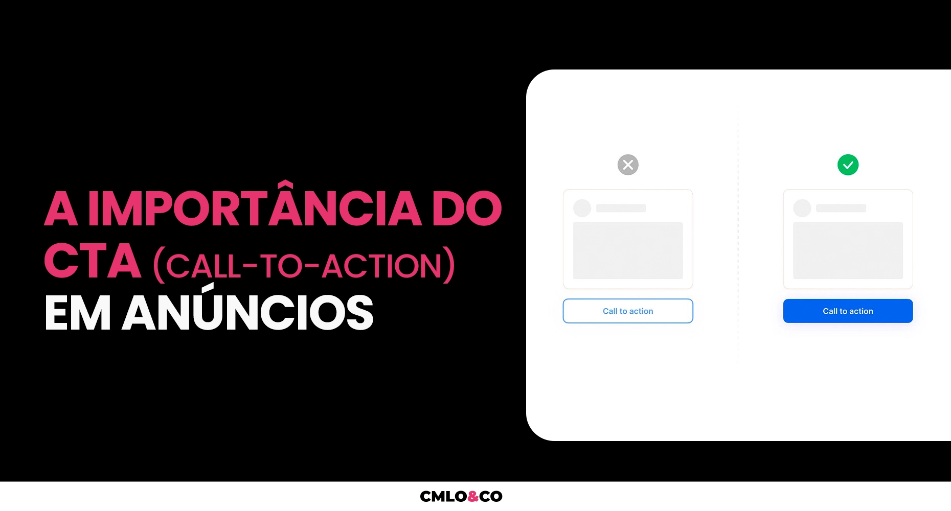
Are you the type of person who clicks on ads? If so, have you ever wondered why you feel like clicking on certain offers and not others? And what makes you do it? The answer to these questions lies in the CTA in ads, or Call-to-Action, which is one of the most important tools for conversion in advertising strategies. paid media.

In this article, we'll explain what a CTA is, what it's for, how it works and how to make calls to action that convert. Follow along!
What is CTA and what is it for?
First of all, CTA stands for Call-to-Action, which means call to action. In practice, it is an element that invites the user to take a specific action that is relevant to your business.
The CTA can be a button, a link, a phrase, an image or any other feature that catches the user's eye and invites them to click, download, buy, subscribe, register or do anything else with your ad.
And what is the objective? The call to action serves to guide the user through the buying journey, taking them from the stage of interest to the decision stage, generating more engagement, relationships and conversions. That's why it must be aligned with the objective of the ad and the profile of the target audience.
How it works
The CTA acts as a psychological stimulus for the user to make a decision.
In fact, it arouses a sense of urgency, curiosity, need or desire in the individual. To do this, however, it must use strong, clear and persuasive words that convey the benefits of the proposed action and create a positive expectation in the user.
And, as we mentioned earlier, the call-to-action must also be aligned with the objective of the ad and the stage of the user's buying journey.
For example, if the ad aims to generate traffic to a website, the CTA could be something like "Learn more" or "Visit the site".
On the other hand, if the aim of the ad is to generate leads, the CTA could be something like "Download the free e-book" or "Sign up now".
Now, if the aim of the ad is to generate sales, the CTA could be something like "Buy now" or "Take advantage of the offer".
The importance of CTAs in ads for conversion
Given all that has been said so far, you've probably realized that the CTA in ads is one of the most important elements, right? After all, it's what will determine whether or not the user will interact with your message.
A good CTA can significantly increase the chances of conversion, as it creates a sense of urgency, need or desire in the user. Otherwise, it can decrease the chances of conversion, as it can be confusing, generic or uninteresting.
That's why it's essential to choose the right words, colors, size and position for your call to action.
Call-to-action formats for your digital marketing strategies
There are various CTA ad formats that you can use in your digital marketing strategiesdepending on the type of media, the audience and the objective. Some of the main formats are:
- Buttons: these are the most common and effective call-to-action formats. They stand out in the ad and make it easy for the user to click. They should have a contrasting color with the background of the ad and a short, persuasive text.
- In-text links: these are the most discreet and subtle CTA formats. They can be used in long or short texts, such as articles, emails or social media posts. Ideally, they should have a different color from the rest of the text and a relevant, contextualized text.
- CTAs on banners: these are the most visual and creative formats for calls to action. They can be used on static or animated banners, on websites or social networks. They should have an attractive image and concise, impactful text.

5 best mental triggers for CTAs in ads
But what are mental triggers? In principle, they are persuasion techniques that activate certain emotions or reactions in the human brain. They are widely used in marketing and advertising to influence consumer decisions.
There are various types of mental triggers that you can use in your CTAs in ads, but we're going to highlight the 5 best:
Scarcity
It's the mental trigger that creates the feeling that something is limited or rare, and that it could run out at any moment. It generates a fear of losing an opportunity or a benefit, and encourages the user to act quickly. Examples of CTAs with scarcity are: "Last units", "Today only" or "Get yours before it runs out".
Urgency
This mental trigger creates the feeling that something is immediate or urgent and needs to be done now. In other words, it creates pressure or anxiety in the user and pushes them to make a decision. Good examples include: "Buy now", "Don't waste time" or "Make the most of it while there's still time".
Free trial
The free trial, on the other hand, is the mental trigger that creates the feeling that something is free or without obligation, and can be tried out without risk. Its great advantage is that it generates curiosity or trust in the user and encourages them to test the product or service. This is the case with: "Free 7-day trial", "Try it at no cost" or "Do a free trial now".
Authority
The authority trigger is a little more complex, as it creates the feeling that something is reliable or recognized, that it has credibility or quality based on the opinion of experts or satisfied customers.
By using this CTA in ads, you generate admiration or reassurance in the user and convince them to follow someone's recommendation or example. Examples of authoritative CTAs are: "Recommended by experts", "Approved by thousands of customers" or "The best on the market".
Pleasure
Last but not least is the mental trigger of pleasure. It creates the sensation that something is pleasurable or satisfying, and that it brings benefits or advantages, generating a desire or motivation in the user, and persuading them to seek the solution or reward.
Examples of CTAs with pleasure triggers are: "Make your dream come true", "Transform your life" or "Enjoy the best".
How to make CTAs that convert?
To make CTAs in ads that convert, you need to follow some good practices that will help increase the efficiency of your calls. Here are some tips:
Take care of the context of the call to action
The CTA must be appropriate to the context of the message, the stage of the user's buying journey and the objective of the ad. There's no point in asking the user to buy something if they don't know about your product or service yet. Therefore, the call-to-action must be coherent with the content of the ad and the value proposition of your business.
Use simple, objective texts
The call-to-action must be clear and straightforward, without any convolutions or ambiguities. The user must easily understand what action is expected of them and what the benefits of doing so are.
A tip here is to use verbs in the imperative, such as buy, download, subscribe and sign up, as well as strong, persuasive words such as now, free, exclusive, among others.
Use contrasting colors
The CTA in ads should stand out in the message, so that the user has no trouble finding it and clicking on it.
To do this, use contrasting colors between the call to action and the background of the ad, but without overdoing it or visually polluting it. The colors should also convey an emotion or a message related to your product or service.
Make sure the CTA is visible in the ad
In addition to the tips mentioned above, remember that your CTA should be in a strategic position in the ad, where the user can easily see it. Therefore, avoid placing it in hidden, distant or too small places.
Explore CTA numbers in ads
Figures can increase the credibility and attractiveness of the call to action, as they can show the user concrete data, such as percentages, quantities, prices or deadlines.
In addition, numbers can also create a sense of scarcity or exclusivity, which are powerful mental triggers for conversion. For example, "Save 70% on your travel package. Offer valid today only", "Be one of the first 10 to sign up and get an exclusive bonus".
Do A/B tests
A/B testing is a way of comparing two or more versions of a CTA in ads to see which one performs best in terms of clicks and conversions.
A/B tests make it possible to identify which elements are most effective for each type of ad and target audience, such as text, color, format, size or position.
To do A/B testing, you need to define a hypothesis, create the call-to-action versions, apply them to a group of ads and analyze the results.
Rely on experts to make CTAs into ads that convert
Making CTAs in ads that convert is not a simple task. It requires knowledge of marketing, advertising, psychology and design.
So if you want to get better results from your ads, you don't have to do everything yourself.
You can count on a team of marketing and advertising experts to create calls to action in ads that arouse the user's interest and offer good results.
Contact CMLO&CO and learn how we can help you increase your sales with more efficient ads.


