Coqueiro website
FOOD - TECH
Briefing
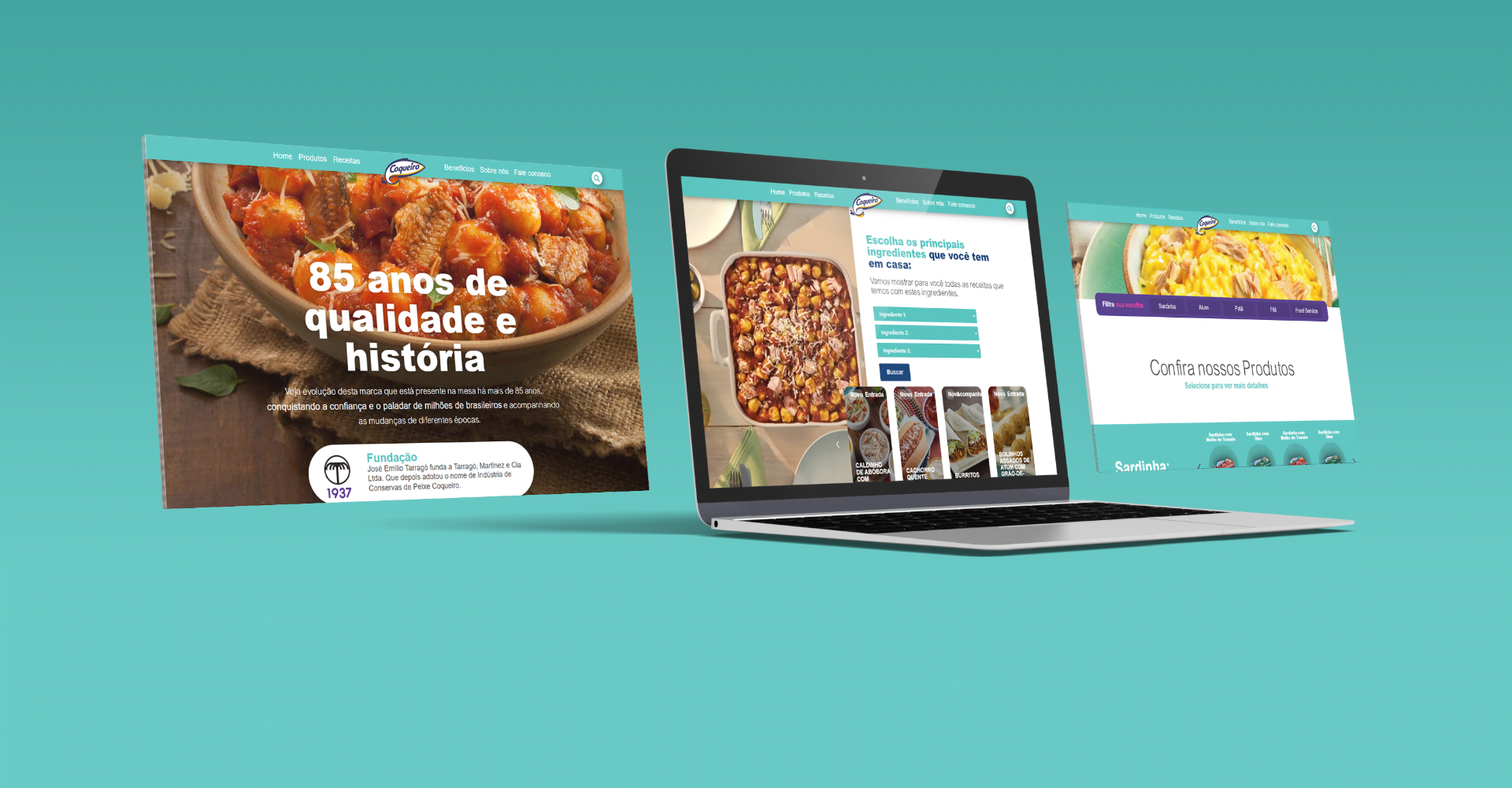
The Coqueiro brand, market leader in the canned tuna sector in Brazil, faced a significant challenge when it underwent a rebranding. In the process, they identified the need for a new website that would offer users an engaging and easy-to-identify recipe experience with their products. Coqueiro was looking for a site that would highlight its recipes in a dynamic and interactive way, providing users with an enjoyable journey in relation to its products.
Solution
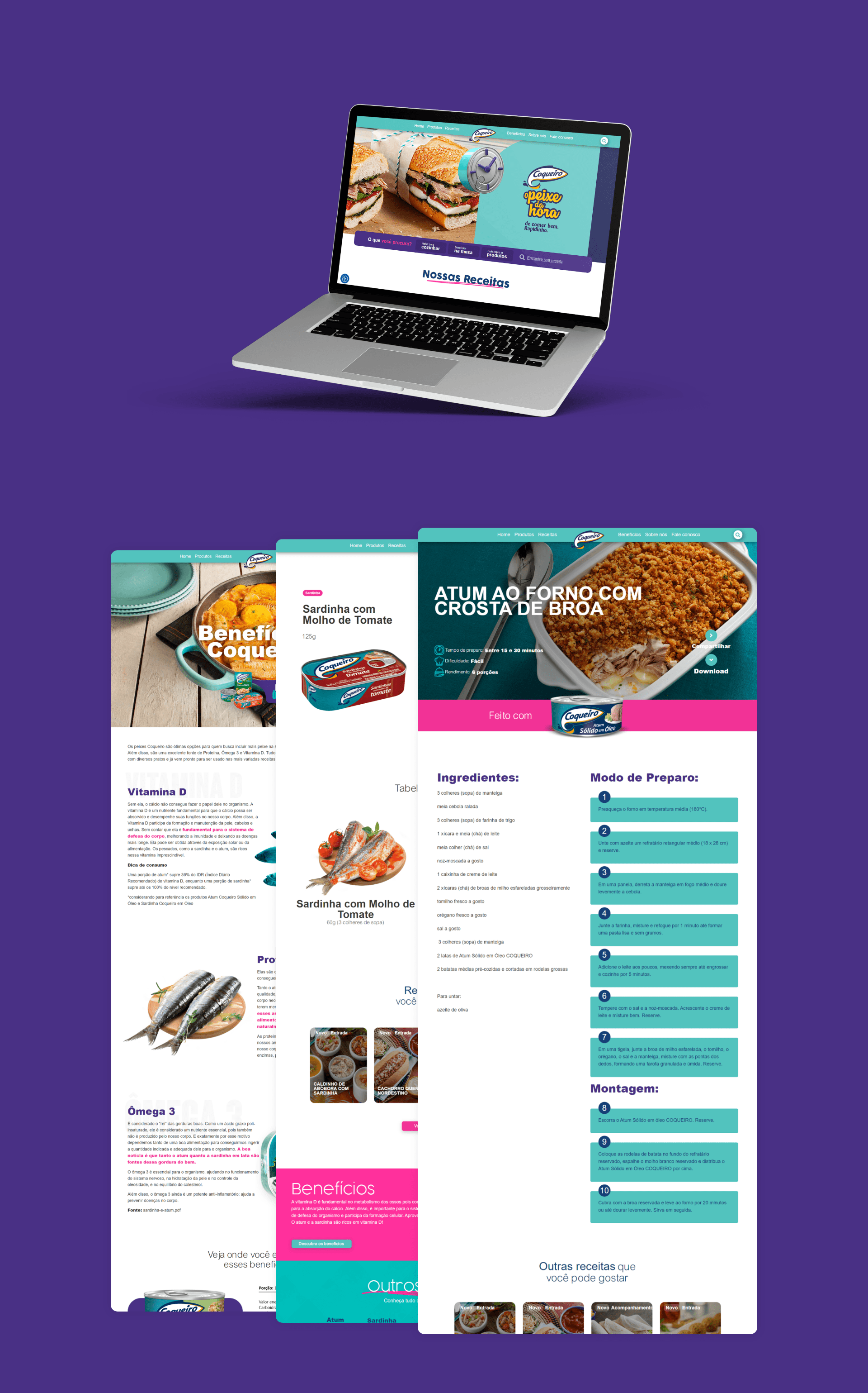
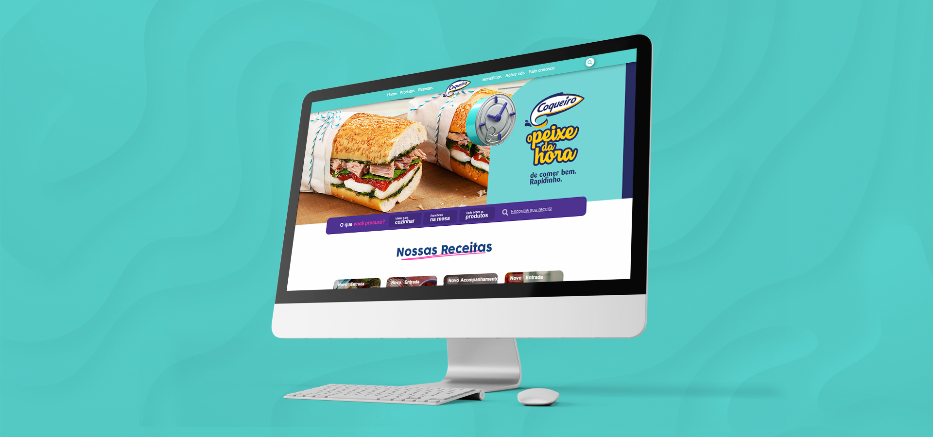
We designed an intuitive website, prioritizing the user experience with a UX/UI-centric design. We implemented a recipe calculator based on the ingredients available to the public. By selecting their ingredients, the user sees recipes related to the products, resulting in a quick and intuitive experience. The focus on practicality and interactivity aims to offer users and fans of the brand an engaging and functional platform, ensuring that they find the best recipes to make their daily lives easier.
Results
The intuitive and functional design will provide users with an engaging recipe experience, making life easier for people who want good, quick and healthy solutions for their diet with Coqueiro. The focus on UX/UI allowed for optimized navigation, easily exploring the options and enjoying the products. The ingredient-based recipe calculator offered a quick and practical search. The user-centered website ensured an engaging and functional platform, highlighting the brand in the market and being praised by Coqueiro's management.
